Showing posts with label Part 5: Narrative and illustration. Show all posts

Thursday, 26 April 2012

Exercise: Rain

For this exercise we have to imagine a magazine cover on one subject - rain.  Given the entire work space to work in I have to produce a single, strong, attractive photograph that leaves no one in doubt as to what the subject is.

Some guidelines I've been given:

  • think of all the effects of rain I have ever seen
water droplets, puddles, splashes, wet roads/pavements, people with umbrellas, umbrellas, dark skies in landscape shots, wet trees and woods, condensation on glass, wet foliage, wellies (usually with little kids wearing them), rainbows, multi-coloured raincoats


  • Keep it simple
  • be interesting and don't settle for something boring like a street shot
  • you many not have to wait for it to be a rainy day for some pictures
  • if you can't be original make it attractive
  • make it attractive even if it is original 


I chose to move away from the traditional approach to rain and opt for a traditional symbol - an umbrella- shown in a more abstract way.

The image shows the inside of a section of the inside of an umbrella where rain has fallen when opening the umbrella in a heavy rain shower.  

Exercise: Juxtaposition

For this exercise I had to choose either a still-life or a larger scale shot with relevant focal length.  The still life approach asks us to take a book and to arrange a still life composition for the cover illustration using two or three elements.

If choosing the larger scale option I have to photograph a person with a possession, or the results of their work or hobby.  The picture has to be eye-catching and thought provoking.

I have taken some time to consider which option I will choose.

I chose to opt for the larger scale option and photograph someone with their possession.


I like the way the wide angle has made the person bigger than his car and also the background scenery.


Tuesday, 17 April 2012

Illustration by juxtaposition

Juxtaposition in illustration refers to the act of putting two elements together so as to suggest a relationship.  The importance lies with the connection between the two.  A connection must be suggested.  The easiest way to do this is in still life where you have control over the objects you want to place together.  It is not as easy in real life situations.

Another way of combining images is to find a viewpoint - together with an appropriate focal lens - that shows the two elements together.  Use can be made of the eye-line of the subject to direct the viewer to something else that would be otherwise insignificant or lost to the viewer.  You can also use a suitable focal length to exaggerate the size of your subject in relation to another element in your image.  For example, if you stood back and used a telephoto lens when shooting a child with an elephant you would be able to exaggerate the size of the elephant dwarfing the child.  A wide angle lens can equally have an effect similar to this where you zoom in close on one subject to make the subject in the background look smaller.

Juxtaposition can be seen in many street photographers work.  David Gibson the London based photographer is well known for his visual puns and juxtapositions as is Nils Jorgensen.


Exercise: Evidence of action

For this exercise I had to produce a photograph that shows something has happened. It was suggested that I include something that has been either broken or emptied.

As part of the exercise, I had to consider abstract ideas and concepts and how they need a more imaginative approach when it comes to a single visual image.  I then had to write down 5 examples of concepts that are regularly depicted in advertising and publicity which cannot be shown directly. These include:


  • Finance and banking - usually shows money, piggy banks, nest eggs, safe for to keep money secure, executive personnel etc
  • Education - can include swotty looking individuals with glasses, getting exam results looking happy, classroom scenarios, blackboards
  • Medical services - tablets, syringes, bandages, crutches, nurses, doctors, crosses 
  • Time - usually Tag Heuer and Rolex get sports people to don their watches as timing is everything in tennis and motor sports.  Sometimes see pilots too, navy personnel.  
  • Religion - crosses, rosary beads, various other symbols of the church like chalices, communion, pews, stained glass windows. 
 Evidence of something that has happened is by virtue a picture taken after an event. Here are some examples:


Here we can see the jar of coriander seeds has toppled over and the seeds have emptied over the work surface.

This is the cat's bowl after she has eaten some of her food.  


The above are very obvious.  When dealing with subjects that are not obvious or even abstract illustration opens up the imagination.  Abstract ideas and concepts need an imaginative treatment to be put across in a single photograph.  

Examples of this can be seen advertising.  

Below is an image that I took for another assignment which is also an abstract illustration.  


Wednesday, 29 February 2012

America in Pictures: The Story of Life Magazine


Some months ago BBC4 aired a documentary about Life magazine presented by Rankin.  I watched this at the time and recorded it to review it when I started the Narrative and Illustration section of the course. 

America in Pictures: The Story of Life Magazine included interviews with several staff photographers from the magazine, their work, their stories and what inspired them to cover the stories they did. 

The first issue of Life magazine hit the shelves in 1936 and changed the way news was reported to people across America.  It is credited with being the magazine that created photojournalism and the picture essay.  The publication was about the pictures, not the text.  It was about the writers carrying the photographers bags and been led by their images. 

Life celebrated America and all things American.  It charted the history of a country on the brink of war to the birth of a super power.  It explored the cities and countryside of America, its people and the development of the nation. 

In the beginning there were four photographers – Thomas McEvoy, Peter Stackpole, Alfred Eisenstaedt and Margaret Burke-White.  Burke-White got the front cover for the first issue.  She was renowned for her use of flash lights and was very meticulous in her work as the first female war photographer.  It is widely known that she used her sexuality to give her professional advantage and would frequently bed generals to get her the best wartime scoops.  A rival photographer at Life was chastised because she was getting all the stories which led to one of the most famous telegrams being sent back to HQ – “Burke-White has a piece of equipment that I don’t have.”

Thomas McEvoy was known for his use of disguise to capture people unawares; whilst Stackpole earned himself the honour of being the mad scientist inventing an underwater camera and constantly looking for new ways to get that picture.

Alfred Eisentaedt is probably one of the greatest photographers of Life.  He worked on assignments throughout the lifetime of the magazine.  His most famous shot is Times Square VJ day with a soldier and a nurse kissing.  It captured the jubilance of the people as the war finally came to an end.  It paved the way for the new generation of America. 

Eisenstaedt used a rolleiflex camera and shot from the hip to make his subjects unaware he was shooting them.  He wanted to capture them as they were naturally and unaware of the lens. 

It was an overnight success and its coverage of WW2 became part of the American psyche.  It was the first time images of the war could be seen as it was actually happening.  Robert Capa landed on Normandy for the D Day landings and sent the rolls back of the horrors of the battle.  It was the first time an image of a dead body had been published and it was a big ethical decision to make.

The photo essays brought an intensity to news stories that hadn’t been experienced before.  The “Career Girl” series by Leonard McCoombe was a very intimate portrayal of women in the workplace.  W Eugene Smith’s “Country Doctor” brought a human element to the narrative of a deeply personal level.  You got a true insight into the lives of the people, the dilemmas they faced and tragedy that often unfolded.  In a clip from an interview with Eugene Smith he speaks of how he “becomes immersed in their life, part of their life and speaks of what he is participating in.”

In the 1950s Life covered the boom years of America showing industrialisation and modernisation of the country that was becoming a super power. 

The 1960s saw its coverage of the Vietnam War.  Life was such a powerful force that when it took an anti-war stance it successfully changed the view of the people of America of their country’s involvement in the war.  Larry Burrows covered the Vietnam War shooting over a nine-year-period until his death when he stepped on a landmine.  In old footage of him he spoke of his guilt of capitalising on others grief and said that he had to do so to make his contribution to show others what people are going through.

Burk Uzzle was interviewed at his home by Rankin.  Burk is still working but focussing and producing some of his best work in fine art photography.  After working for Life he went on to become a Magnum photographer.  Burk comes across as very much a free spirit where everything is about capturing the moment when the subject reveals itself.  Burk never took Life up on the opportunity to become a staff writer preferring to work on a contract basis.  His anecdotes about heated argument with picture editors probably points to why. 

One assignment Burk was sent to shoot was the Playboy mansion.  Rankin unwittingly asks him what that was like to which he gets the reply “well it made me horny.”  I suppose if you ask a stupid question…

Another photography featured in the programme was Bill Eppridge who was particularly skilled at embedding himself with his subjects.  His coverage of a couple who were heroin addicts was published after spending 6 months with the couple.  He also got the ‘shot’ of the assassination of Bobby Kennedy.

At this point in the programme you have to worry about the BBC’s choice of Rankin as a presenter.  Eppridge asks him to go fishing with him whilst they talk.  As they walk to the river Rankin quips how he in not dressed for this to which Eppridge replies “I’m sure the fish won’t mind.”  You would expect there to be more pressing matter on Rankin’s mind other than whether he got his shoes dirty or not, especially when in the presence of a great documentary photography that risked his life to get the picture. 

Harry Benson the Glaswegian celebrity shooter talked about his life as a ‘rat’ snooping around trying to get the image required.  His techniques for building up relationships with the people he shot varied but he maintained that he never took them up on dinner invitations because they were not his friends.  They were people he shot.  Being friendly and seeing them outside of a professional environment would open the door to them trying to influence his decisions in what images made the cut.

The programme concluded with a brief interview with John Shearer who captured the civil rights movement in New York during the 60s and 70s.  He claimed he didn’t see the danger in his work and the places he found himself – it was all about the pictures.  To protect his work he used to stash his films at different delis around the city in case it got damaged in the field. 

The programme was a very general overview of Life magazine through the years.  It didn’t go into detail too much about the photographic techniques used by the photographers or their work in particular.  I can only assume that this was because it was geared towards a very general audience.  Rankin I felt was a weak presenter and asked timid childlike questions at times and his attempt to capture a modern day version of Eisenstaedt’s Times Square image absorbed too much time.  Time that would have been better spent fish with Eppridge. 

Since watching the programme I have put together these online resources for the people either interviewed or mentioned in the programme. 


Exercise: Symbols

The idea of this exercise is to find symbols for a number of ideas.

Growth - symbolised by eggs, seeds, plant shoots
You could shoot a heavily pregnant woman for this shot as that shows both the growth of the woman herself and of the human race.


Excess - I think of this too as greed, can be someone oversized eating, an overflowing bag of money
I can't help but get that scene from Monty Python's Meaning of Life out of my head with the guy eating in the restaurant.  I would like to be excessive in my treatment of this shot and show something like a gang of riot police running down the road after a child.

Crime - hands behind bars, jail cell, courts, handcuffs
I would shoot a person handcuffed with their hands either behind their backs or in front (as seems to be the norm these days) and crop the shot so the hands and mid torso fill the frame.  To make this more interesting it would be good to have the flashing lights of a police car cast a hue of blue on the image.  Or perhaps have part of the crime scene in the frame.

Silence - quiet and still landscape or cityscape devoid of people and movement, a graveyard, person going ssshhhh
A boat on a very still lake would be a little cliched but to make it more interesting you could look at shooting when you have an interesting sunset.  A person in a snowy field with nothing for miles would also suggest silence.


Poverty - homeless person on the street sleeping rough, people begging, busking, run down council estates.
I think I would like to get some people into this shot to make it come to life.  I would opt for the run down estate or perhaps some poorly dressed children with very worn clothes going to school.


Illustration by symbols

This may seem straightforward but there are certain things you should avoid.  Cliches - which we would think of as the most obvious things that spring to someone's mind - have been over-used and done to death.  However, if you could show the cliche in a new or interesting way then you may be able to use it.  We would need to life the idea out of the ordinary there.

You don't want to end up being too obscure by avoiding the obvious.  In order for a symbol to work it must be recognisable.  Certain symbols can mean different things in different times or cultures so you may want to be aware of your target audience. It must also be practical to shoot if you are going to make use of it.


Illustration

Illustration in photography relates to telling a story in a single image.

This is something I have been experimenting with throughout this course.  I have on a few occasions been successful but on the whole I have found it a little difficult to realise.
The step-by-step approach to telling a story in a sequence of images is pretty easy.  It is something we have been taught to do - the step-by step narrative - since we started school.

How do we tell a story in a single image?
Well we obviously can't tell the step-by-step kind of story in a single picture but we can tell a different kind of story - one that shows the relationship of things or hints at something happening.  Still life tends to open more opportunities when looking to tell a story in a single picture because it offers the photographer more control.

Many books and magazine covers have illustrated that derive from a still life scenario.  However, we can look more to documentary photographers and street photography to tell us a story that is real and not contrived.

Henri Cartier-Bresson is seen as the photographer that developed real life documentary or street photography which has influenced many photographers that came after him.

A story in a single image can be seen in the likes of Don McCullin's work on the effects of war.  In Shell-Shocked Soldier, 1968 we can see the psychological effects of war on the the subject.  His uniform and gun tell us he is a soldier but the fear in his eyes, the distance he is staring into and the grip he has on his gun tells us of the fear and shock and horrors he has seen.  In the case of this picture that horror is hinted at.

This image is one I took a few months back.  It is of a woman reading the paper beside her beach hut.


Exercise: A narrative picture essay

For this exercise I had to compose my own narrative picture essay.  I chose to keep this simple and straightforward which turned out to be a little more challenging than expected.  


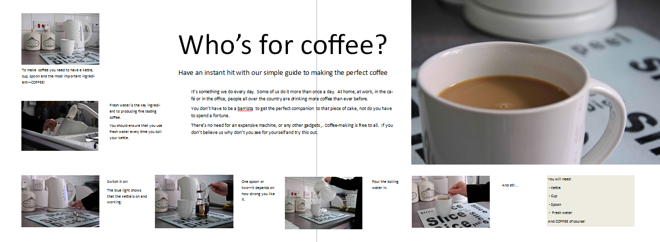
Making a cup of coffee.  This is something that we do everyday and so almost without thinking.  This meant that I had to think and plan the process for shooting and also draft an outline for the narrative.  


Before I got all the objects required for the shoot  - kettle, ingredients, model - I drafted an outline for the series of pictures that would be required.  


  1. All the essentials for making the coffee
  2. Filling the kettle
  3. Turning the kettle on
  4. Putting the coffee in the cup
  5. Adding the boiling 
  6. Stirring the coffee
  7. The finished product


To make the coffee you need kettle, cup, spoon and coffee

Fill the kettle with water

Turn the switch on.  The blue light indicates the kettle is on.

Put a spoonful of coffee and powdered milk into the cup

Pour the boiling water into the cup

Stir till dissolved

The cup of coffee!

I think looking back we did things like this at national school, where we had to draw a picture narrative for something like my journey to school or maybe an event like my holy communion.  It was strange to be trying this again although the camera helped a lot as I'm sure than my sketching skills are a bit rusty these days.  

I am glad that I chose something simple for this exercise because it demonstrates that a plan and a little bit of research and preparation are required to do even the simplest of shoots.  Using a visual narrative rather than text almost makes this every day event more interesting and different.  


I did a little sketch in Publisher of how I would like it to look or how it could look in a leaflet or brochure on how to make a cup of coffee.


Thursday, 23 February 2012

The Sunday Times 50th Anniversary Exhibition


“My God, this is going to be a disaster.”

These were the words Roy Thompson the owner of The Sunday Times uttered back in 1962 when the paper became the first to include a colour magazine.  The idea was thought of as ‘barmy’ but within a short time quarter of a million new readers came on board.  Fifty years on, the idea of a weekly paper without some kind of supplementary magazine is incomprehensible.  

The Sunday Times celebrated 50 years since it launched the first colour magazine this January/February with an exhibition of some of its most celebrated, iconic images at the Saatchi Gallery in London. 

As I am studying narrative at the moment, I thought what better time to go and see some of these images from the ground-breaking magazine for myself.

I occasionally read The Sunday Times.  These days it comes with so many supplements/magazines it keeps me entertained way beyond Sunday and well into the week.  I have enjoyed the magazine mainly for its features on far off places, places and peoples we’ve forgotten exist and the realities of war from a variety of perspectives.  The magazine buys into the cult of celebrity in a manner that is tolerable for me.  I cannot bear the modern obsession with ‘celebrity’ and the never-ending tirade of drivel and tell all tales about people that are famous for simply being famous.  I don’t care where these people eat, what their dogs are called or whether they’ve had plastic surgery.  However, I do want to know more about my kind of celebrity – someone who has performed an outstanding achievement who we can look up to and admire.  The Sunday Times magazine in general embraces that type of celebrity. 

The images in many of our best-selling magazines are more preoccupied with revealing the shocking news that some celebrities have cellulite, have put on weight or are wearing clothes from a high street store.  They don’t have much of a story to tell.  They are about unveiling evidence that these people that the magazines idolise are flawed and imperfect. 

I want more out of what I read and see than that.  I want to be able to produce better images that that.  I want to appeal to an audience with more interests in life than that. 

The exhibition included some of the work of the world’s finest photographers to have worked for the magazine – Don McCullin, David Bailey, Eve Arnold and Uli Weber to name a few. 

Overall I found the exhibition very interesting as it was less a trip down memory lane than a history lesson.  I found myself recalling events I had forgotten had occurred and asking myself was it really that long ago since such an event occurred.  With a good mix of good photojournalism covering the landing on the moon, the Iraq war, and the fall of Gadaffi to the rise of the Pop Princess Kylie Minogue and Prince Charles and Diana, the images provided a balanced picture of life in the last 50 years. 

Uli Weber's image of Kylie Minogue


The picture that will stay in my memory for years to come will be of Jose Pequerio an Iraqi veteran who lost 40% of his brain in a grenade attack.  The photographer is Eugene Richards and the image is taken from his series War is Personal. It is both shocking and thought provoking.  It depicts sadness and hope, the human being’s ability to survive and the power of a mother’s love. 

The work of Eugene Richards

There were some drawbacks though.  The project rooms were pretty small and had a lot of images crammed in which would be fine when the gallery was quite.  However I went on the last Saturday of the exhibition (they’ve since extended it) and it was packed.  This made navigating the rooms extremely difficult and left me wishing I was taller to be able to see over the sea of people and getting a better view.  Perhaps the longer captions for the images further delayed the flow of people. 

The combining of image and text in this exhibition provided the viewer with a greater insight into the work on display.  The use of a caption which was printed as a header in bold acted as a teaser to encourage the viewer to read the text below it - some 100-200 words - depending on the piece displayed.  This accentuated the picture narrative style which is something I hadn't experienced in an exhibition before. 

On the plus side, it gave me some food for thought and a good introduction to an iconic magazine. 

More information:

Friday, 10 February 2012

Visual Language and Narrative and Context


I have a degree in English.  I have trawled my way through Dickens, Defoe, Spencer’s The Fairie Queene, medieval delights and Anglo Saxon battlegrounds.  I’ve been enlightened by Shakespeare and the American poets; liberated by Yeats. 

I have spent many years since graduating working within the confines of the rules applied to the English language.  I have written copy, features, proposals, information leaflets, letters, poems and the odd short story.  I have overcome the mental block that stood in my way when faced with grammar and its application.
 
I have found a way to use the tools available to me.  And in turn those tools have helped me find out more about who I am, what life experiences have taught me and where I belong in the world around me.

As I approach the end of this module The Art of Photography I know what makes me tick and although I can communicate that through words I now have to explore the reality of communicating it visually.  Visual language is an entirely new proposition. 

I’ve been reading Maria Short’s book Context and Narrative and several questions have arisen about my work to date and where I go to from here.  How do I communicate my ideas visually? How do I breathe life into a concept? How do I ensure audience engagement?  What technical considerations do I need to contemplate?

In her book Short describes what’s needed to be a photographer…”you need to be passionate about communicating ‘something’, as this will inform every choice you make in relation to your work.” She continues, “you also need to interested in the world around you; you need to be interested in things beyond photography. The substance of the work is in your commitment to your subject, as this will show in your photographs, this commitment will make your photographs breathe; this is how your personalise your work.  If you are clear about why you are photographing your subject then you can choose how to photograph your subject, and in turn this should help your audience interpret the photograph.”

This is the way you communicate your ideas; this is visual language; this is how you develop your voice.
There’s a three-way relationship between photographer, subject and audience – a communication triangle.  The treatment of the subject by the photographer and the visual language applied has a direct influence on how the audience interprets the picture in front of them or if they care to interpret it at all. 

Picture making is not divorced from the photographer’s life experiences and beliefs.  In many images the influence of the photographer is apparent.  They construct the image, it is a trace of what they see and how they want the audience to render meaning from it.

What is a photograph?

It is an image of the past, a moment that was captured and frozen in time.  It is a document of what happened or what was present. 

Photographs can be simply records, like medical or forensic images, or they can be something more.  They can tell a story.
 
The key to a successful photograph is engaging with the subject. 

A photograph is a way of expressing an idea, of developing a concept and of storytelling.

What is narrative?

A narrative is basically a way of telling a story.  It usually has a beginning, middle and end.  In photography, a visual narrative works slightly differently.  It can have the basic structure of beginning, middle and end or it might simply imply what has happened in the past or is about to occur.  It may be a fictional interpretation of a given person, place, thing or moment. 

Linear narrative
In photography a narrative can take be communicated in a linear sense, but it can also be cyclical.  It can be a series or images or a single one.  It can be a collection of images that only make sense when brought together. 

Visual continuity
Images can be linked by using visual continuity whether that is weather, subject, location or another linking factor. 

Sequential narratives
Narratives can also be sequential stories or journeys like a pilgrimage that takes you from A to B. 

Visual punctuation

Visual punctuation includes the breaking of the sequence by including a black and white image or one of a different size – something that interrupts the flow.  It can be a one off. 

Juxtaposition can help raise an argument or present a question; the tension between hot and cold, light and dark for example.

The eye of the camera also plays a role.  Is the eye a fourth wall, the eye of the subject or the eye of the viewer/audience?

Symbols and signs

The study of signs is called semiotics. 
To familiarise use with the models and terminology we can look at the work of two philosophers.

Ferdinand de Saussure
Dyadic approach.  The signifier (form which the sign takes) and the signified (the idea/concept it represents). 

Charles Sanders Peirce
Three tiered approach
Representament – the form the sign takes
Interpretant – the sense made of the sign
Object – to which the sign refers. 

Barthes on a more basic level looked at the ‘studium’ which he described as the general interest in an image and the ‘punctum’ which arrests the attention. 

Symbol

Something that represents something else.  In this case the signifier does not represent the signified – this relationship must be learned like rules or language.

Icons

The signifier is perceived as resembling the signified or imitating the signified.  For example, in a portrait, cartoon, with gestures or sound effects etc.

Indexicality

Indexical signifier is physically or casually linked to the signified.  This link can be observed or inferred.  Natural signs like smoke = heat, footprints = footsteps. 
Indexicality is very important to photography because it is a literal ‘trace’ of the original subject according to Peirce.

 Visual Metaphor

Use of a subject as a visual metaphor for something the photographer wishes to express.  This can be seen in the work of Short herself in her collection Gall. In this body of work she uses a horse as a visual metaphor to “express how I felt about the challenges that faced young women in relation to their sense of identity and social placing.”

This enabled her to raise questions such as “when is protection suppression? When is freedom a cliché?”

Enigma and truth

An enigma is something inexplicable.  We can capture something that looking back can never be explained like someone’s actions or an event. 

The truth always brings up the question of ethics in photography.  The camera never lies has long been discounted and even more so today.  Photographers are often faced with situations where visually strong images are captured in a fast moving environment that present questions surrounding ethics and integrity. 
These fleeting moments are part of the visual language and may represent an idea or concept that can become emblematic or metaphorical. 

Thursday, 26 January 2012

Narrative

Narrative is the way in which we tell a story using a set of pictures.  We could refer to this as a picture essay.

A narrative treatment suits subjects that are made up of several parts or events that have a sequence of how they occur.  This could be a wedding, a football match, a school play or the preparation of a meal.

Plotting the story is very important.
Take an event for example - when and where is it happening, what is the order of events, who is participating and what exactly are they doing and when.  If this is an event that occurs regularly you can do some research on the internet to see what images have been taken in the past.  Do a recce of the event and where it will take place.  Locate prime viewpoints for shooting. Check with the organisers about any restrictions. Is there a rehearsal? Can you go to it? List of potential shots.

Get variety in your shots.

  • Vertical and horizontal shots
  • Images taken at different scales from distant to close up
  • Use lenses of different focal length
  • Variety of colour, like including pictures that are mainly in a single colour
  • Variety of lighting


Narrative and Illustration

This part of the course focuses on the subject in our imagery.  Up until now on this course a lot of my focus has been on creating attractive and pleasing pictures.  I suppose this is not just down to the exercises I had to complete but also down to the fact that I was learning a lot more about using my camera and the best way to get the effects I wanted.  


I have dabbled a little with focusing on the subject when I experimented with street photography but felt that I didn't torn between making the picture pleasing but also interesting from a contextual point of view.  


This section of the course will enable to direct my attention to the subject.


In the introduction to this section I have been asked to find two photographs from magazines/newspapers to find the most contrasting examples of subject and treatment. In one of the images the subject should be of little importance but the image making skills paramount.  The other images should have the opposite qualities where the subject is important and the image handling unremarkable.  These images will mark the ends of the tug of war scale between the subject and its treatment or between content and form.  


This image of sardines on a bbq was taken from a website and it what I would call graphically pleasing.  The lighting is enhanced by the flames from the bbq and the horizontal and vertical lines make for a good composition.  However, there is no story to be found only form.  


On the contrary, this image is from a news website for a story about the Olympic Games.  Mo Farah is a big contender for a gold medal in the long distance running.  The image is all about his previous success, he is smiling, with the British flag held behind his back.  This picture is not particularly well balanced one of his arms has been cropped out of the shot. The crowd in the background is barely visible.  He is smiling but this is for the cameras in front of him.  It is posed and looks like a snapshot. 


This part of the course is going to challenge me to take pictures of my subject whilst showing what is important about it, and why it is interesting instead of on the grounds of it being simply graphically attractive.