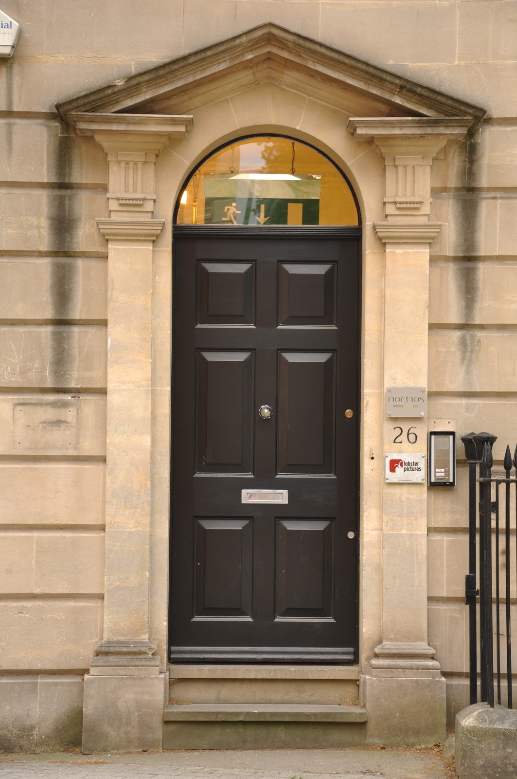
The purpose of this exercise was to take a series of shots in a vertical format. Up until now most of the shots I've taken for this course have been horizontal. I have always felt pretty comfortable taking shots vertically and I tend to shot this way for people or tall buildings. Taking a horizontal shot after a vertical was going to be a challenge for me.
After satrting the project I found that I was constantly looking for tall buildings to take or trees for landscapes.
Here are the results. Some of the pictures are not affected too much by shooting vertical but for some vertical works better. For the tall buildings vertical makes them feel even taller.
The horizontal shot here shows more of the background.
This was one of those feeting moments where this girl was taking a picture of herself beside the fountain. I chose to take this vertically as the focus was on the girl and not the fountain. If I shot horizontally I would have got some of the fountain in the image and this would have taken away from the girl.
Because this white goat was positioned very high the shot was easier to capture vertically if I wanted to just have the sky as the background. It doesn't work so well horizontally as the focus moves away from the sculpture's head.
Shooting vertically allows for a more close up shot of this statue. Horizontally takes in the background to give more perspective.
I feel that both work well here. I like the building in the background of the horizontal shot.
The vertical shot gives a greater sense of depth.
I didn't particularly like the railings on the window so the vertical allows me to exclude these from the picture.
Vertcial shot makes you feel like you are on the bridge just about to walk over it.
The vertical shot minimises the busy background. Both formats work effectively.
The vertical shot makes the building feel taller.
The vertical shot was the most natural for me to use in this situation.
The vertical shot is less busy in the background and focuses more on the memorial.
There were railings to the left of this image so the horizontal format wasn't suitable.
I think the horizontal image works best here as it captures more of the building.
Using the different formats gives two very different perspectives of the catedral entrance.
The vertical format focuses more on the building and was easier to compose.
I shot this vertically because I wanted to capture the size of the map this man is looking at.
Shooting vertically allowed me to focus on the building and the Opticians sign which is what drew me to the shot in the first place. I could have focused on the sign alone for the horizontal shot but without the building I don't feel it would have worked.
The vertical shot allowed me to include more of the water and where it was landing. However, I prefer the horizontal shot.