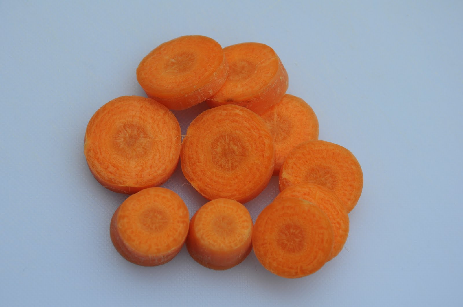
Here are the results.

One stop darker - the best as it records the bolts more accurately

1/2 stop darker - still keeps the detail but a little brighter than reality

Average - the meter reading has made the image brighter. Not acceptable to me as it is too bright.

1/2 stop brighter - again this is too bright and the blackness of the image is lost.

1 stop brighter - the darkness of this image is completely lost and the image looks over-exposed.

1 stop darker - gives mood to the image and brings out the red of the house.

1/2 stop brighter - the sky is beginning to look a little washed out

Average - makes the image look flat and the colour in the sky is lost.

1/2 stop brighter - this image looks over-exposed at the top

1 stop brighter - the image is greatly over-exposed

1 stop darker - the bricks are deep and colourful and this works well.

1/stop darker - the bricks have lost a little colour but this image is still acceptable.

Average - the average reading has given a washed out effect to the colour in this scene. It is still acceptable though.

1/2 stop brighter - the bricks look much brighter and very different to the first image. They are still acceptable but no longer look like real bricks.

1 stop brighter and over-exposed. Nearly all detail is lost.

1 stop darker - I feel this is too dark and some of the detail is lost in the shadows.

1/2 stop darker - still some detail lost in the shadows but it is better than the first image.

Average - this gives a good and fairly accurate recording of what the scene was actually like. There's more detail that the darker images.

1/2 stop brighter - this is also good and the greens are vibrant.

1 stop brighter - the greens are a little too bright. I think average works best for colours like green because it gives a more realistic reading for the colour.

This detail is from my garden fence and looks like 2 horses' faces.
1 stop brighter and it has a dark mysterious air. You can see the texture.

1/2 stop brighter - this still holds the texture of the wood.

Average - gives an average that is pretty acceptable.
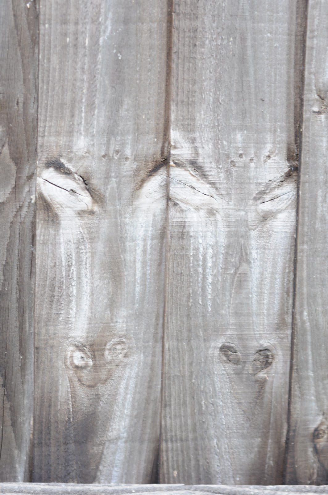
1/2 stop brighter - takes on a different hue and the whites become brighter. A very different scene but it still works.

1 stop brighter - this also is bright and works well. A good example of how the light can change a subject into something very different.
On the whole the average reading are nothing more than that - average. They meet what we would call an acceptable exposure. however, if you want to show and record the scene as it really is and capture the shadows, highlights and colour more realistically varying the amount of light hitting the sensor will allow you to do that.