Producing images that match these 6 colours closely is easier than it sounds. Of course some colours are easier to get than others, but when you try and get those colours from natural sources and not man-made decorative surfaces.
Here are my results:
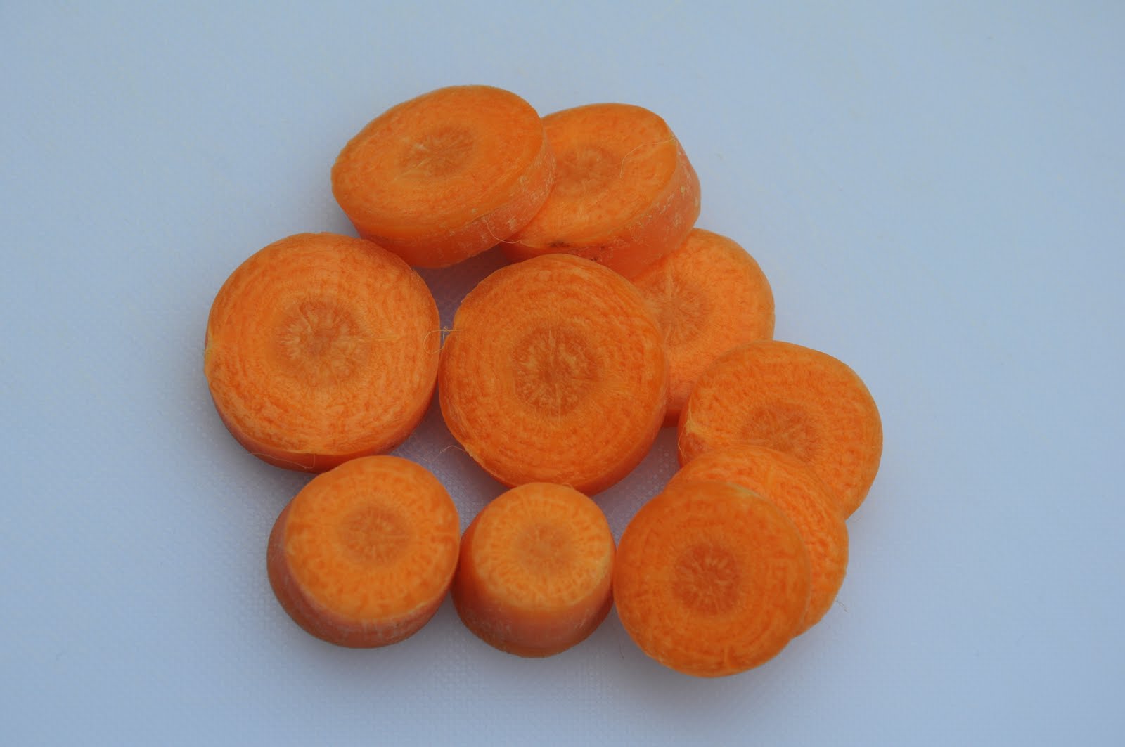 |
| Orange - Average The most like orange on the wheel |
 |
| Orange - 1/2 stop brighter |
 |
| Orange - 1/2 stop darker |
 |
| Green - Darker Most like the green on the wheel |
 |
| Green - Average |
 |
| Green - 1/2 stop brighter |
 |
| Yellow - 1/2 stop darker |
 |
| Yellow - Average Most like yellow on the wheel |
 |
| Yellow - 1/2 stop brighter |
 |
| Red - Average |
 |
| Red - 1/2 stop brighter |
 |
| Red - 1/2 stop darker Most like red on the wheel |

Blue - Average

Blue - 1/3 stop brighter

Blue - 1/3 stop darker
Closest to blue on the wheel

Violet - Average

Violet - 1/2 stop brighter

Violet - 1/2 stop darker
Closest to violet on the wheel
From this exercise I have learnt how exposure affects colour in my pictures. Over-exposing images makes the colour brighter. Under-exposing makes colours darker and more saturated.
Yellow is an example from this because when it is darker is becomes a different colour - ochre.
No comments:
Post a Comment